Putting New US Census Bureau Data in Context
April 27, 2021
As a geographer, one of the things that’s important to me is putting the United States in a global context whenever I can. So when the U.S. Census Bureau released updated population figures for states today, I decided to revisit one of the most controversial demographic questions: Is the United States overpopulated?
Anxiety about “overpopulation” can be traced back to Thomas Malthus in the early 1800s, the book the Population Bomb by Paul Ehrlich in the 1960s, and recently former President Donald Trump’s claim related to immigration that “the U.S. is full.”
Using data from the U.S. Census Bureau and the World Bank, I created two graphs. Density is measured in people per square area. The U.S. data uses people per square mile and the World Bank data uses people per square kilometer. To adjust to square miles, I divided each population number in the World Bank data by 0.3861018768 to get population per square miles. (I found a handy conversation calculator here.)
The first graph shows U.S. population density compared to other countries in the world. The United States ranks in the bottom 25% of countries, with less than 100 people per square mile.
The second graph uses the new census data to show how individual U.S. states compare to other countries in the world. D.C., New Jersey, and Rhode Island rank high in terms of population density even on the global stage. Other states, including states that border Mexico and are often sites of intense debates about immigration — specifically Texas, New Mexico, and Arizona — have low population densities, not just in the United States, but compared to countries around the world.
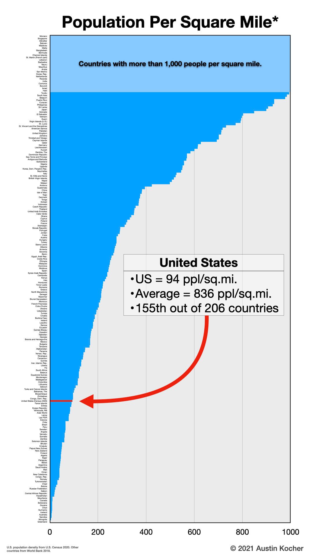 Graph 1
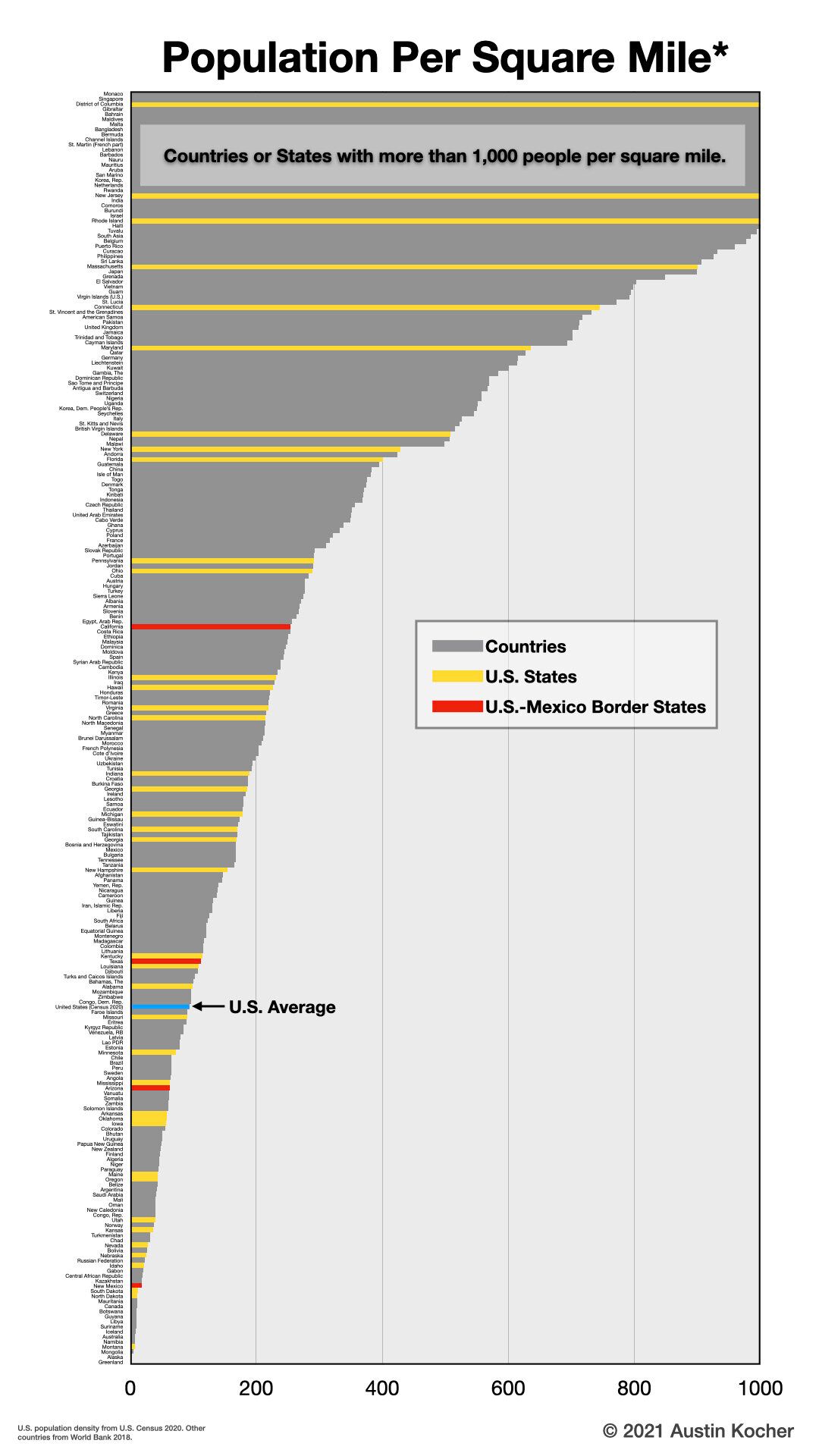 Graph 2.